Redesigning and launching a new web site is a daunting task with many things to take into consideration. One of the key considerations for us was to bring our web site up-to-date from both a design and a technology perspective. From a technology perspective that meant to bring it into HTML5/CSS3 coding standards, to make it responsive, and to use a content management system (CMS).
WordPress

Taking those three items in reverse order, the obvious choice for the content management system was WordPress. Why? Because:
- WordPress powers much of the web that uses content management systems. According to Wikipedia, WordPress was used by more than 23.3 percent of the top 10 million websites as of January 2015. (source: W3Techs.com)
- It has been around and supported since 2003 (an eternity in Internet years). (source: Wikipedia)
- By one source it has over 60 percent of the CMS market share. (source: W3Techs.com)
- It is used by some very impressive companies such as The New Yorker, Vogue magazine, The Smithsonian, Time magazine (source: wordpress.org)
- It is very flexible with extensive plugin and theme support, as well as a powerful architecture allowing for easy customization
- It is a breeze to keep up to date
Responsive Design
 |
vs. |  |
The next consideration was to make the site responsive. In a nutshell, responsive website design (or RWD) simply means that your sites pages work well on a variety of different devices and screen sizes without having completely different sites for desktop and mobile devices. This means that your site gracefully adapts to the device, whether it be a desktop with a 28 inch monitor, or a tablet with a 10 inch monitor, or the latest iPhone or Android phone.
In our case, looking at our Google Analytics, over 85 percent of our visitors are using desktops. About 15 percent of our visitors, at this time, are using mobile devices (phones and tablets). But back in January of 2013, the desktop usage was over 92 percent. There are more and more mobile devices being used each year, and if you have a web site, you should be thinking about the user’s experience on the platform they are using.
For our site we implemented RWD is a unique manner. Typically RWD uses a combination of scaling and reflowing content to fit the different screen sizes. We implemented a strictly scaling technique, one that always keeps the integrity of the design at different screen sizes. We did this by coding a WordPress plugin that automatically scales the design and applies different CSS rules at defined breakpoints. This allowed us to lay out our designs using absolute positioning, which for our coders made the building for the pages very easy.
HTML5/CSS3
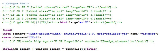
The last consideration was to use HTML5 and CSS3. Both technologies are current recommendations of W3C (World Wide Web Consortium). Modern browsers support these technologies. There really isn’t a reason not to use them. Reasons to use them include:
- Better support for accessibility
- Better video and audio support
- Semantic markup for better SEO
- Easier to code and style pages
Summary
In summary, WordPress provided a powerful, customizable platform that supports HTML5 and CSS3. While we could have used a pre-existing WordPress theme that supported traditional RWD out of the box, we wanted to create a WordPress site that was not a typical WordPress site. Using the flexibility of WordPress, we implemented a purely scaling solution to RWD and also a unique content “slider” to show our “left” and “right” brain approaches to content.