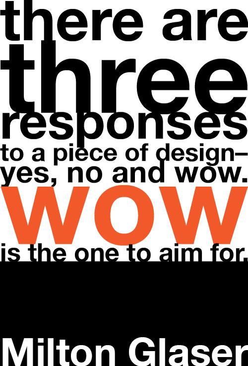
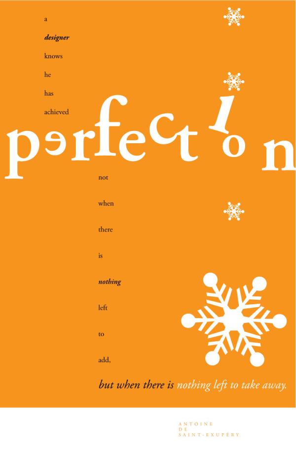
Leslie, our Creative Director, recently sent me some examples of graphic design she had created. She took some design-oriented quotations and rendered them graphically. She placed a constraint upon herself: each design was limited to a single font. She did three different designs of two different quotations, for six total. The two quotations were
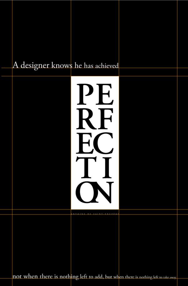
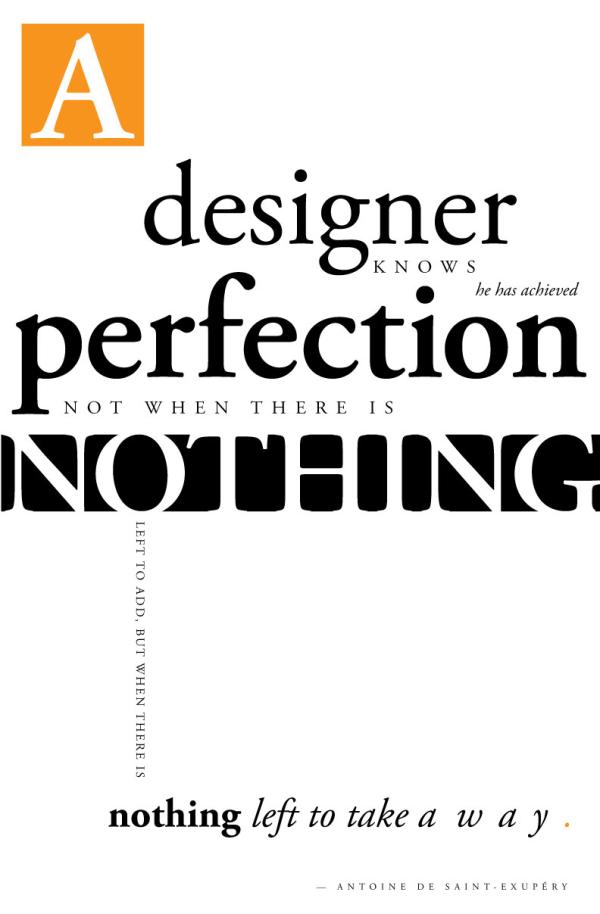
“A designer know he has achieved perfection not when there is nothing left to add, but when there is nothing left to take away.” —Antoine de Saint-Exupery (done in Garamond)
and
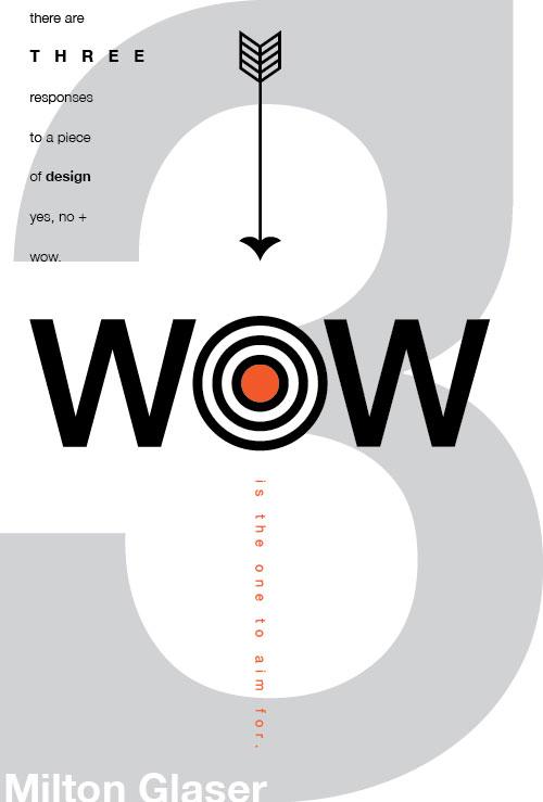
“There are three responses to a piece of design: yes, no and wow. Wow is the one to aim for.” —Milton Glaser (done in Helvetica)
She created these in Adobe Illustrator. You can see her work below.
I was both impressed with the design and intrigued with the question of whether or not I could create similar works using HTML—more specifically HTML5 and CSS3. I kept the same constraints she had, using the same fonts . She used Helvetica for the “wow” poster and Garmond for the “perfection” poster. I would only use HTML text and CSS styling. I would not use any graphics (images or canvas elements). Since HB Design’s company tag line is “uniting design + technology,” this seemed like an appropriate exercise.
Here are the six pieces that Leslie created. Click on the thumbnails to view (or right click and view image in a new tab):
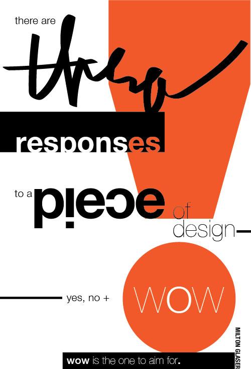
I chose one of each quotation and set out to see what I could create with HTML5 and CSS3. Below are three examples I created. Click on the thumbnails to view (or right click and view image in a new tab):
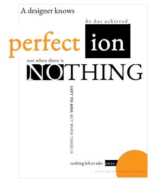
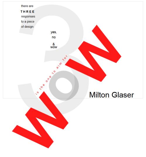

Each was coded with text and CSS only. There are no images used. I used Google fonts for the “perfection” designs (KB Garmond) and Helvetica for the “wow” design. The first step on each was to build the HTML structure to hold the text elements that I would be styling with CSS. Then I would use CSS to style, resize, and position the text.
I was pretty happy with the outcomes, although I learned that while HTML5 and CSS3 give designers more tools and flexibility than their predecessors, there are still issues. First and foremost is browser compatibility. I discovered that various browsers render type significantly differently, and this can affect the width and position of elements. A block of text on one browser may be wider on another and then cause other elements on the page to move.
Also because of the size of the text I was working with, rotating the text at odd angles degraded the quality of the text. The width of parts of the characters changed during rotation. With small text sizes you don’t notice this, but when the text is very large the effect is noticeable.
You can view my interpretations by following the links below.
My interpretation of “wow” (Helvetica)
My interpretation of “perfection” (Garamond)
Duplication of Leslie’s “perfection” (Garamond)
Visit the pages and then view the source code to see the HTML and CSS code.