Background
I’ve always had an itch for going against the grain and speaking up for what I believe in. The 1960s time period spoke to me because I think back then, there was an air of taking controversial issues head on. It was a time of counterculture and free expression. I think the graphics and colors used in my poster reflect these elements of the time.
Content
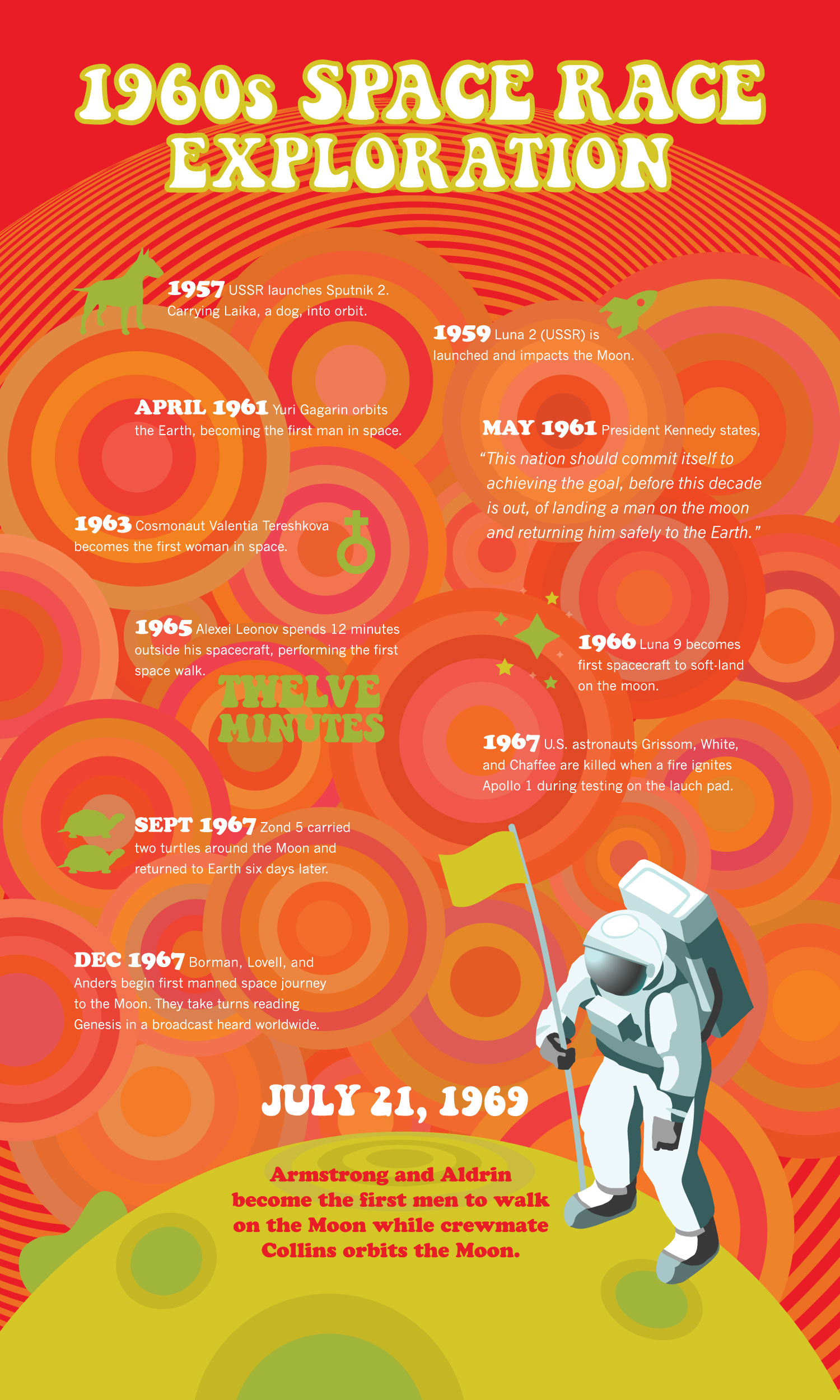
I focused specifically on the space race between the US and what used to be the USSR because the heavier themes of the 1960s (war, protests, assassinations) are a drag!
Striving to land a man on the moon was a daunting and seemingly impossible. Being in space is something most of us will not experience in our lifetime, and that’s what makes the subject a little out there. This is part of what I think made this endeavor so captivating, both now — and then.
Design Style
Optical art and psychedelia gained popularity in the 1960s. Op art is a style of abstraction that relies on geometry, lines, and color to create optical illusions. The psychedelic culture was all about distortions of perception, LSD, vibrating colors, and hand-drawn type.
I infused these styles into my design in juxtaposition to the space race which seems like the opposite of that distorted style — very scientific — representing “the establishment.” I feel bringing these two ideas together, made for an impactful design.