Try Googling that question! When I Googled it I got 361 million results, so it seems to be a question that a fair number of people are asking. I also think that the answer is somewhat complex.
Part of the answer is that people tend to follow the current design trend, even designers. And in the world of the Web, design trends are influenced by what works. It is kind of like the automobile industry. Think about the cars from the 1950s. Shiny chrome, fins, elaborate grill work and head lights all made cars of that era exciting and distinctive. But now the auto industry has certain metrics that need to be met, such as miles per gallon and safety standards. Those metrics influence the aerodynamic shape of cars and bumpers, which tends to make all cars look the same. In the Web world, the metrics are conversions and SEO results. If a design doesn’t result in those metrics improving, then that design is dropped for something that does work. And people copy successful designs.
I think another factor is the current technology trend toward responsive Web design. In general, for the content to be responsive it needs to be in a fluid grid layout that allows for the repositioning and resizing of the content. This becomes a design requirement which then guides the design options. Some of these requirements may bring additional cost. Users are unwilling to pay the extra cost for design options that may or may not result in improved metrics.
The cost factor is also illustrated by the use of design templates in content management tools such as WordPress. These templates are influenced by the factors described above: effectiveness, responsiveness, and cost. Users purchase these templates because using them is more cost and time efficient. As more people use the templates, without taking the time to customize them to make them unique, more web sites look the same.
There is also the functionality factor. Logos, in western culture, are most visible when placed in the upper left. Navigation is most functional at the top or upper left. The use of headers and footers and the type of information in them is related to how well they function for their purpose.
Now that I have said all of that I would also like to point out that the question is also somewhat false. Sites may have similar layouts, but color schemes, fonts, and photos all are part of the site’s visuals. Many sites really don’t look same. Let’s compare some Web sites that are in the same market space.
Google and Bing
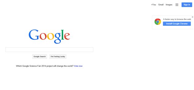
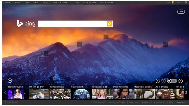
These are as about as different as you can get. Google is minimalist and Bing is not. Both have the search box proximately placed, which is a functionality requirement.
MSNBC and CNN

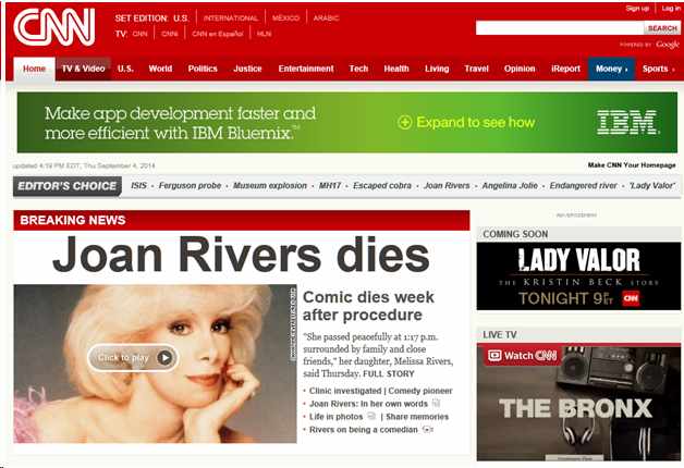
Do these look the same? They share some similarities, again due to functionality issues. News sites have to display multiple stories in an eye-catching way. At the same time, they need to provide users easy navigation to the areas the users want to visit. In both of these sites, there are links at the top to help users find the stories they want to read. Note the “Ferguson” link on both sites. This was a current story in the news that both sites needed to feature. Because of functional requirements, the two sites implemented these links in a similar manner. But also note the different color palettes and the size of the logos. The CNN site is using Georgia for the story font and Arial for links, while MSNBC is using NeueHaasGroteskTextPro for both. Another big difference between the two sites is that MSNBC uses large dropdown “mega” menus (Explore, Watch, etc) and CNN does not.
Apple and Microsoft
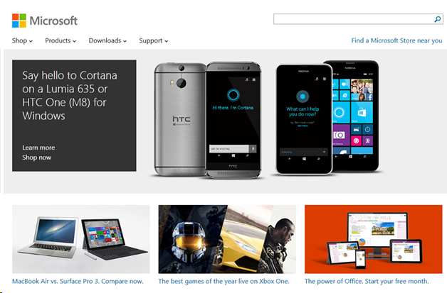
Apple was the design trendsetter for Web in the past. Now, Microsoft’s new flat “metro” design seems to be the new trend. In both cases, the site’s visuals are driven by the corporate identity of each company. And, the Apple site is using a current design trend: a full-bleed background image with a large central message.
HP and Dell
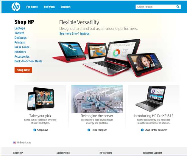

Now these two sites are very similar. What is interesting is that neither of these pages are responsive. Both have similar color palettes. HP opts for banner-like images with a list of links, where Dell use large button-like links with photos for each of the navigation sections.
Take a close look at the examples above. Ask yourself what is similar and what is different between each of the sites in the examples. What is driven by functional considerations or technical considerations? What could be done to make one site stand out more without affecting its usability and effectiveness?
Can you make a Web site stand out? Of course you can! Think back a few years to the number of Flash-based web sites. Today you can do similar designs using CSS3 animations and HTML5. But those sites often suffered from poor SEO and usability. If all you are concerned about is the visual impact and not about SEO, usability, and analytics, then you really do have an open design canvas where you can do almost anything. However, as you start to care about those features and functions they constrain your design canvas.
If you are in the process of changing your current web site to a new design, you need to ask yourself how to have an effective Web site, adhering to your corporate identity, meeting your goals for the site, and at the same time having a unique and recognizable image. When people come to your site, they need to find the information they are looking for easily, and at the same time identify with your corporate identity and feel good about being on your site. Even when sites use similar layouts, fonts and colors, good design (both visual and functional) can make one site stand out from the other.


