One of the services we offer to clients is a usability review of web sites or web-based tools. Sometimes we then are fortunate to help improve the site or tool. Being given the opportunity to review interfaces created by other firms means that we continue to develop our awareness and sensitivity to user interfaces. Because of this background, when we use web sites or web-based applications, we look at them a little differently than the casual user might.
We’ve collected a list of best practices to build on the earlier post about Web-based applications and the importance of usability:
- Lists of folders and files should be sortable. Users expect to be able to do this in their operating system, so they expect to be able to sort lists in a web-based tool.
- When files are listed alphabetically, don’t sort file names beginning with upper case letters separately from files beginning with lower case letters. Your tool may think this way, but your users won’t.
- Include a “loading” icon, so the user understands that the application is working behind the scenes to update the page. Without this, the user may think the application has crashed and close it.
- Give an indication that the user must manually refresh the page to see the results of an action if the page doesn’t automatically reload. This could be an icon or text.
- Develop your application to work across common versions of common browsers. If you aren’t able to support the tool after it’s been implemented, give a nod to this in any browser specific error messages: “This is best viewed with Internet Explorer 9” instead of “Your browser does not meet the requirements. (Browser version is not supported.)”
- If you are creating a tool that will be used by a technical audience, be sure it works with their tools, such as Firefox plugins or the more standards-compliant web browsers.
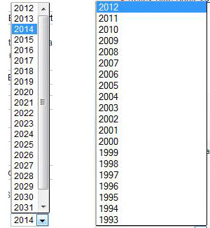
- Consider whether a common widget you have seen used elsewhere will work for the task being completed. For example, the drop down on the left would be awkward for a birth date. The drop down on the right works well for birth dates or the year a car was made, but not for an expiration date.

- Display the items in a drop-down list in an order that makes sense to the user. Defaults might be alphabetical or chronological, although these are not the only options.
- Make sure you don’t disable common browser features such as: the back button, bookmarking pages, tabbing between fields on a form, typing the first letter to jump within a drop down list, or using the enter key to submit a form.
- If you use a popup window, allow the user to re-size it.
Search results deserve their own list because they are deceptively complex:
- Allow the user to choose how many results they want to show on a page.
- A user should be able to click on an individual entry within search results to view that item. Display context for how this entry fits within the rest of the site through use of breadcrumbs, page titles, or other visual hierarchy.
- If you provide breadcrumbs for an entry viewed as part of search results, make sure they work.
Do you have other good practices to add?
